Hedeselskabet delivers green innovation. We delivered their new brand purpose.
After 150 years of doing business Hedeselskabet's top management wanted to redefine the company's brand identity for the first time since 1984. But how do you balance a legacy that has become part of Danish national history with modern business innovation? We delivered a new purpose and visual brand that now creates value in an increasingly digital, collaborative society. The new brand supports the subsidiary businesses of Hedeselskabet's group through a clear brand strategy, a new visual concept, and a new digital solution.
Identity exploration
Exploring the characteristics of the organizational identity is key to creating succesful brands. No less when the brand carries 150 years of social entrepreneurship and a prominent role in national history. Our journey towards Hedeselskabet's new brand was two months of intense anthropological research throughout the country, participating and interviewing members of the organization; board members, association members, employees and experts associated with the company.
Immersing into the culture of Hedeselskabet our analysts got to understand the company's complex identity. Hedeselskabet is both a social community and a corporation built on a strong heritage of helping poor farmers and foresters to cultivate the Danish soil. Our exploration of Hedeselskabet also contained a quantitative analysis of how Hedeselskabet creates value in its member base, and how the readers of the associations magazine perceived the organization and its magazine.
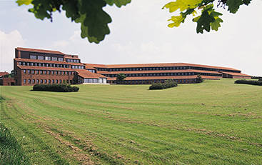
Hedeselskabet headquarters
The buildings in Viborg surrounded by large fields of grass, where the company has resided for the past 40 years.
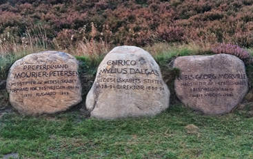
“Mindelunden" – memory lane
In the middle of Jutland the founders and supporters of the cause of Hedeselskabet are honored with their names engraved.
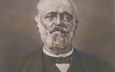
Founder Enrico M. Dalgas
The founder of the cause and company in 1866. A social entrepreneur before the term existed, now famous for his visionary thinking and his achievements helping the Danish farmers.
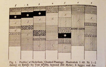
Graphic inspiration from company library
Different types of soil, nature and fields are described with fine graphic art – one of many inspirations to the purpose and to the actual graphic design.
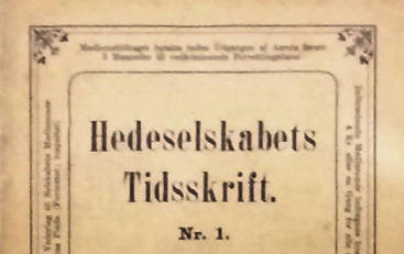
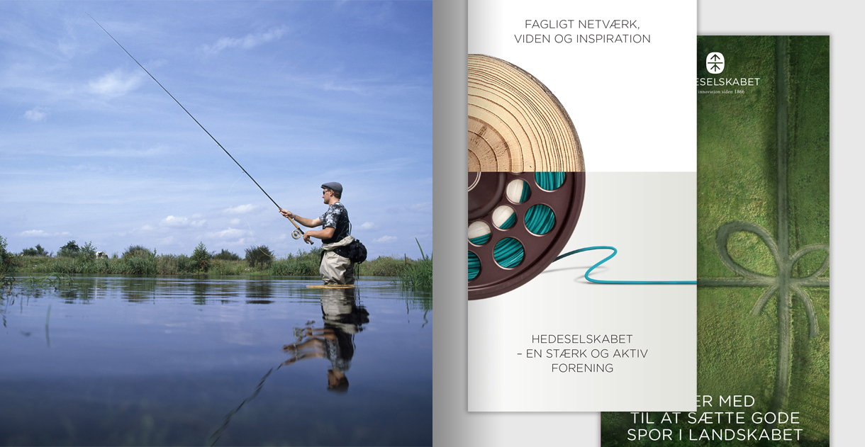
Hedeselskabet's magazine
Published for more than 100 years with different front pages and typography, we advised to bring it into a more contemporary form to deliver on the same purpose as then.

Observing and interviewing members
The organization, as well as the members, helped us understand the organization, the cause and the authentic strengths of Hedeselskabet.
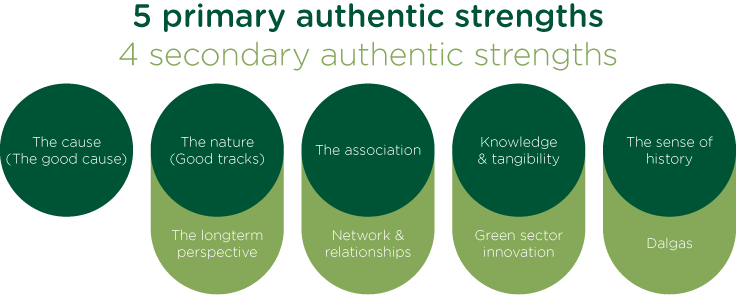
The authentic strengths of Hedeselskabet
The inherent characteristics of an organization can become a valuable inspiration for a company's brand formulation, purpose and innovation. We reported the authentic identity of Hedeselskabet to the board of directors and the committee of representatives. The indicators of Hedeselskabet's authentic identity, which we chose to work with were:
- Good tracks set in the Danish landscape
- Social entrepreneurship by founder E. M. Dalgas
- Green innovation (environment, energy, nature management)
- Conveyed knowledge between practitioners and experts
Defining future purpose
The future purpose for Hedelskabet and its brand strategy was defined in a series of five workshops with the company's chair of representatives, board and CEO. We developed four strategic directions, each of them demonstrating a possible future scenario containing different possibilities, initiatives and advantages.
The process of discussing and redefining an organisation's purpose and brand is not an easy one. But our four-step scenario process helps leaders explore and understand their possible future scenarios before deciding and refining the strategic direction and positioning of the business:
- Develop four distinct directions for the future development of the company based on the authentic strenghts. Define stakeholders, value delivery and purpose of each scenario.
- Explore which considerations, types of decisions, initiatives and costs that would be necessary and beneficial in each scenario.
- Further develop scenarios to deliver the best possible value, then select the winning scenario for the companys purpose.
- Focus and refine the exact wording of the purpose and brand essense. Discuss what the consequences of the new brand purpose will be for the stakeholders involved.
The new purpose of Hedeselskabet
The redefined purpose also serves as Hedeselskabet's brand essense – it guides strategic decisions on board and managerial level and sets the direction for the branding and communication initiatives.
We create green innovation and develop solutions for climate change and nature management. We convey knowledge between practitioners and experts in order to secure a longterm development, use and protection of the natural environment. Brand essense passed by the board
Brand strategy and brand architecture
Our counsel on the new purpose and strategic direction also contained a new brand architecture and definitions of how the new brand would impact the most important stakeholders of Hedeselskabet. Several brand names, legal names and internet domain names were removed from the portfolio in order to create a more clear and efficient monolithic brand in the future.
Brand design
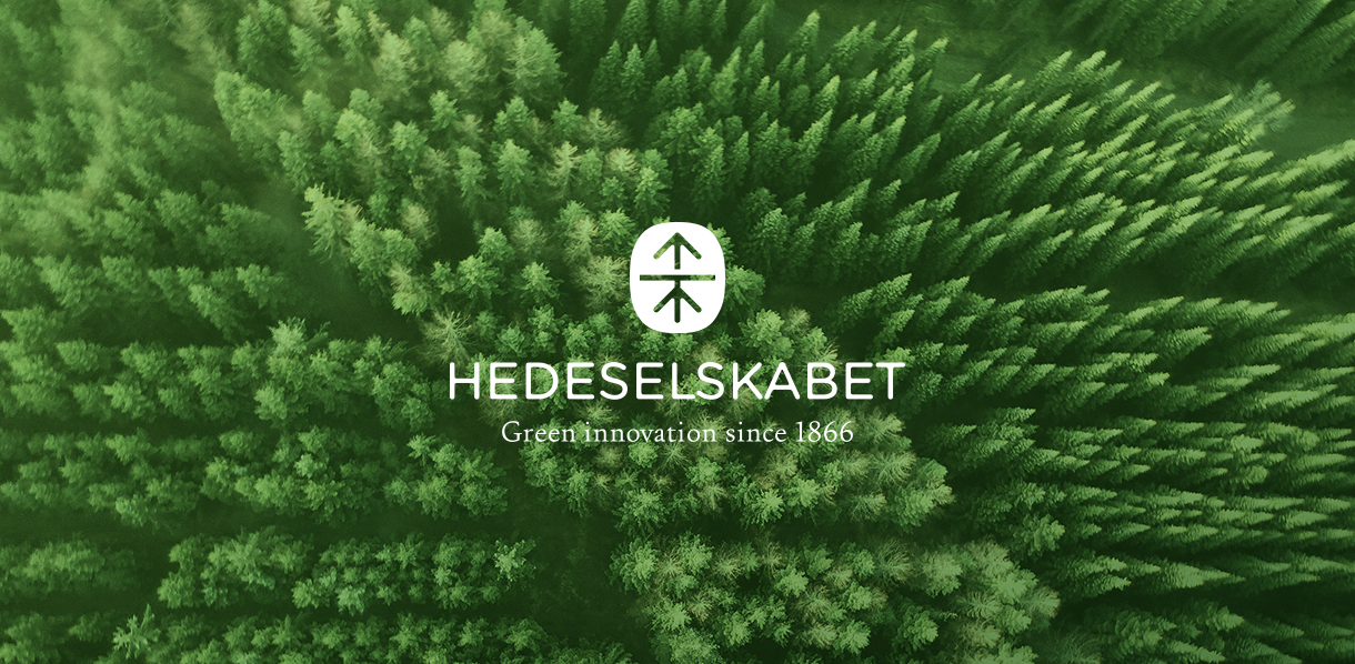
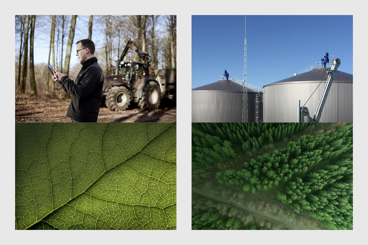
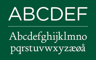
Hedeselskabets visual image brings the brand identity to life. The new logo, typography and tag line brings the old brand into contemporary time. We developed a concept for the use of photography, color, use of images and infographics and translated the visual identity into guidelines and concrete use in the company's paper line, digital universe and HQ wayfinding.
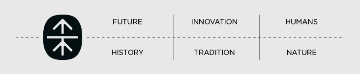
Setting good tracks in the landscape
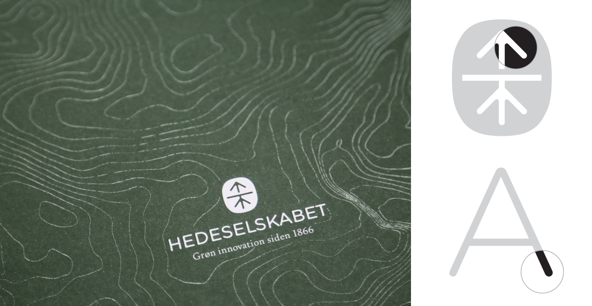
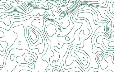
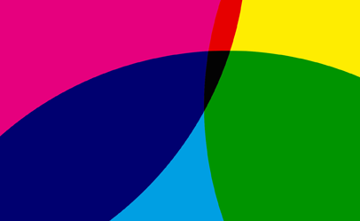
Designing a new corporate visual identity is an efficient way of giving the soul of the organization a physical body. It is the body language of the company. We created the new logo referring to signs of nature and innovation. The imagery unfolds the contrasts of the brand: Tradition versus innovation. Nature versus people. History versus future. Through many graphic elements the horizon line from the logo continues as a line of seperation of the images.
Guiding the design of the company
The new visual expression of Hedeselskabet was translated into simple guidelines that help the organization keep a consistent look and feel. By unfolding the visual identity through every visual touch point we delivered the entire identity from signage and outdoor banners to business cards and digital templates, empowering the organization to seamlessly take the new brand into use.
Digital life
Hedeselskabet's brand is becoming a digital brand universe for its members and the customers of Hedeselskabets Group. We helped develop the digital strategy. Now the website is the place where the association recruits members, offers events and shares knowledge.
Prioritizing user needs
Hedeselskabet's website serves an extremely wide range of users with various needs: 2,500 members unified by a passionate interest in nature management. School children visit to learn about Danish history. Professionals within farming and forrest management look for services. We analyzed the needs of the different user groups and based the new digital strategy on the new brand essens. The first priority was to get more members by sharing knowledge between experts and practitioners.
Experience design and a new look
Our user experience (UX) process helped focusing what is placed where – and what the focus of the website is. By reorganizing the content and building the information architecture from scratch the users now get relevant information and a positive experience when they visit the website. The images now mirror the everyday of the members and employees in a modern way. The website has large copy, uses lots af space, and has long pages that work well on tablets. Large interactive top menus give the brand a contemporary feeling, featuring quotes and guidance.
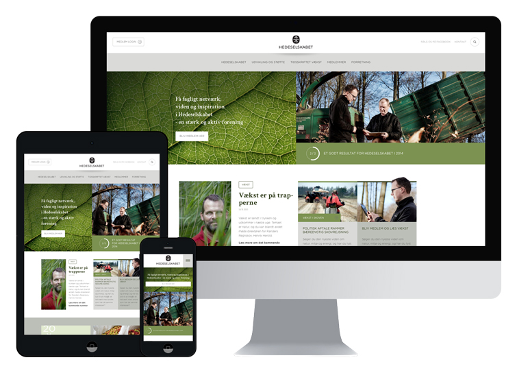
Implementing the new digital platform
We implemented the new corporate website on an open source platform and delivered the first launch within two months from formulating the digital strategy, giving the users a new online experience of the brand. The members have priviledged access to event signup, they can read articles and share personal information on a protected level of the website.
Communicating the identity
Hedeselskabet has a rich heritage, work in a world of natural wonders and have thousands of brilliant people and projects. Everything you need to tell is good stories. Now the company is communicating the new brand identity through every touch point.
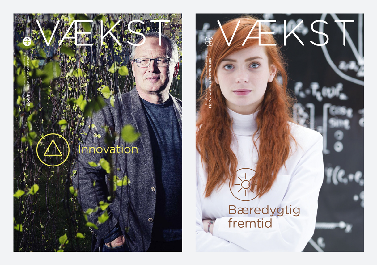
Magazine "Vækst" to members
Hedeselskabet's magazine "Vækst" ("Growth") has been published for more than 100 years. We researched the attitudes and opinions of the readers and developed a new editorial strategy. As a result, the magazine got a new contemporary design featuring a different paper quality, large images, bold use of type and longer articles, so that readers get a sense of quality and immersion into the story.
Membership activity and member recruitment
One of the core activities of Hedeselskabet is events for the members, where they enjoy trips in the Danish landscape and learn about developments in nature management. As part of the new purpose and redefinition of the brand we helped develop new communication about membership benefits, events and how to become a member. We created brochures, gift certificates, season programs and the visual identity for the committee of representatives' annual conference.
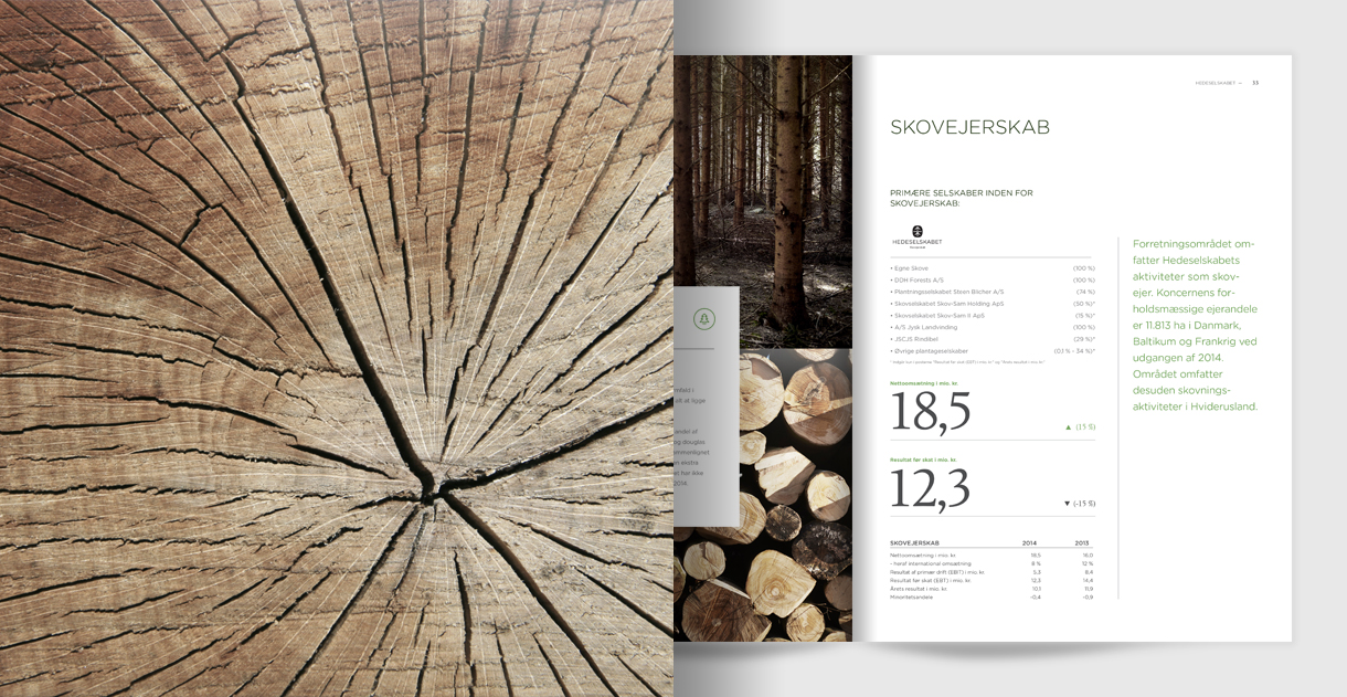
Bringing the brand into the annual report
An important effect of a new brand is the new expression of the corporation's financial reporting. Exciting projects from the subsidiaries, infographics based on the tangible world of nature and innovative use of typography lets serious reporting meet a dynamic visual brand. The effect is a new perception in the minds of Hedeselskabets stakeholders.
The visual concepts were brilliant and brought our annual report to a new stage and the planning of the process went well. All in all we are proud of our final product. Michael Kristensen
Communication Manager, Hedeselskabet
Transform your brand
Would you like to know more about repositioning your brand and expressing your inherent strenths? Meet us for a cup of coffee and we will give you our honest opinion on the possibilities for strengthening your brand and business. Give us a call or write an email to Nikolaj Stagis. We can help you develop a clear purpose and strategic direction, transform your brand digitally and communicate your strengths.
Related cases
-
Novozymes
An innovative employer branding strategy fulfilled in a creative exhibition stand helped Novozymes attract the biggest talents in a competative jobmarket.
-
Nordisk Film Cinemas
Naming process and a new visual identity helped Nordisk Film Cinemas introduce new digital film technology and secure the leading position in the industry.